

Data on maps
Python project.
Thanks to the library Folium, some topo-json and data, we are able to display data on a map. In this article, we are going to display percentage of voters for different parties in each canton of Switzerland.
GitHub link: https://github.com/Apiquet/Visualyzing_Data_On_Map
To displaying data on a map through Folium we can use several types of data. Here, I’m going to take json files (available on my Github repository, link a the end of the article).
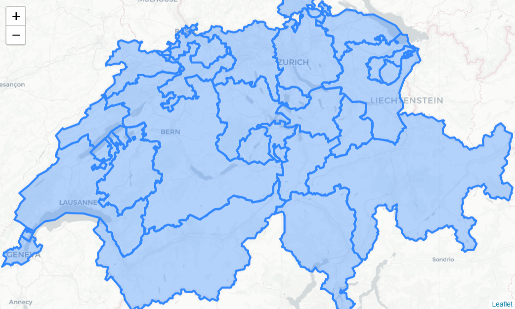
1- Visualizing a country
First we need to import Folium: import folium as fl
Thanks to a google research we can find the localization of any country, I choose to display Switzerland (coordinates: 46.8131873 , 8.22421)
swiss_coord = [46.8131873 , 8.22421]
swiss = fl.Map(location=swiss_coord,tiles='cartodbpositron',
zoom_start=8)
Then, thanks to a json file which refers the cantons, we can display the cantons of Switzerland:
topo_data = os.path.join('data', 'ch-cantons.topojson.json')

fl.TopoJson(
   open(topo_data),
   'objects.cantons',
   name='topojson'
).add_to(swiss)
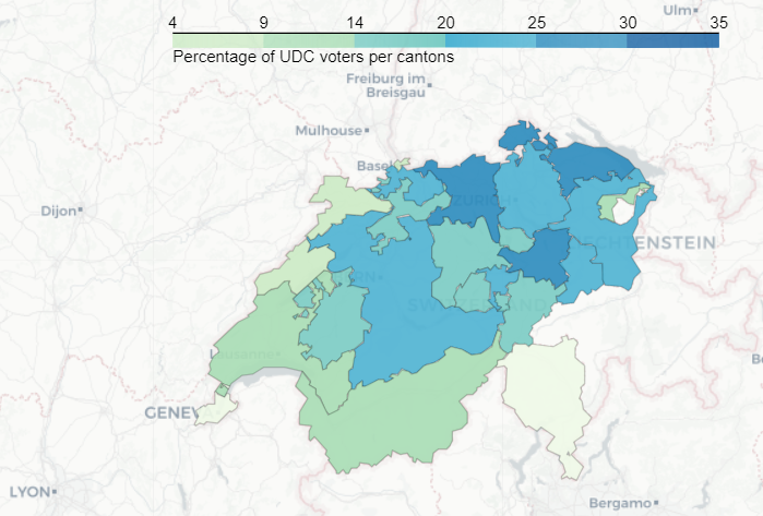
2- Visualizing percentage of voters per canton
At this point we have a dataframe with the data we need (percentage of voters per canton) and the cantons’ representation.
We are now ready to display the percentage of voters in each canton. The choropleth function will allow us to do the visualization. It needs to have the geo data (the cantons’ representation), the data (the dataframe with percentage of voters per canton), the key to refer each canton to its percentage (the canton code) and the color (here: GnBu):
results_percentage_series.choropleth(geo_data=geo_json_data_2,
   data=percentage_series,
   columns=['Code', 'UDC' ],
   key_on='feature.id',
   fill_color='GnBu', fill_opacity=0.9, line_opacity=0.2,
   legend_name='Percentage of UDC voters per cantons',
   reset=True)
3- Displaying markers with content on the map
The evolution of each party in each canton can also be displayed. We will use markers located on the capital of each canton. To achieve this goal, we can first pick the name of the capital of each canton from our csv file: canton.csv. Then, we can add a marker on its [longitude, latitude]. To add a content on the marker we simply write a string in HTML format and add it through the second parameter of the method folium.Marker():
for x in lat_lng_capital_code:
   try:
      party_name_progression= list(zip(df_progression_interactive.loc[x[3]].index.tolist(), df_progression_interactive.loc[x[3]].values.tolist()))
      html = x[4]
      for pnp in party_name_progression:
         if pnp[1] > 0:
            html = html + pnp[0] +str(np.floor(pnp[1]*100)/100))
         if pnp[1] < 0:
            html = html + pnp[0] + str(np.floor(pnp[1]*100)/100))
   except:
      html = x[4]
   fl.Marker(x[0:2], popup = html).add_to(results_map)
fl.TopoJson(
   open(topo_data),
   'objects.cantons',
   name='topojson'
).add_to(results_map)

You can find the whole code on the following link:
https://github.com/Apiquet/Visualyzing_Data_On_Map
